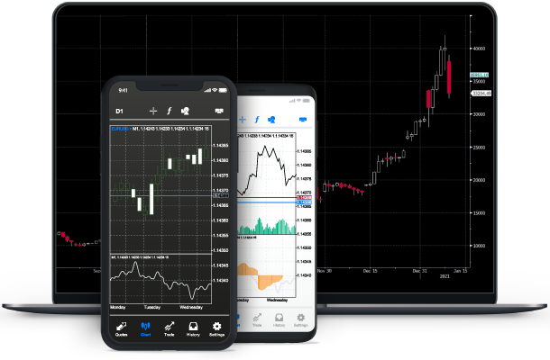
Trading Guides: Understanding the Charts
It’s very important to know how to read and understand a forex chart. A forex chart is a graphical depiction of the exchange rate between currencies.
There’s a number of types of charts to help depict trading data. Below we present the three main chart types: Line, Bar, and Candlestick.
![]()
LINE CHART
The Line Chart is easy to understand for Forex trading beginners. In a line chart, the line is drawn from one closing price to the next.
This chart can be used to identify both historic and present price movement of a currency pair in order to determine different patterns.
![]()
BAR CHART
A Bar Chart shows the opening, closing, high and low of the currency prices.
The top of the bar represents the highest paid price whilst the bottom of the bar indicates the lowest price for that specific time period.
The actual bar represents the currency pair’s overall trading range and the horizontal lines on the sides represent the opening (left) and the closing prices (right).
A bar chart is most commonly used to identify the contraction and expansion of price ranges.
![]()
CANDLESTICK CHART
A candlestick is a chart which is mostly used by traders for the extensive information it provides. The chart displays the high, low, opening and closing prices.
This extra information enables traders to study how the price has moved over a period of time compared to just seeing the price closed at that specific moment.
The red and green portions of the candle are known as the body which represents the difference between the opening and closing prices of the currency for a given time period.
If the opening price of the candle is lower than the closing price, the candle body is green. If the opposite occurs and the opening price is higher than the closing price then the candle colour is red.
The black lines above and below the candles are called ‘wicks’ or ‘shadows’ and represent the highest and lowest reached prices during the given time period.


